
Well, no reason really. I just put it there to be cool...but it could also be an insignia that was put on them after Durandal enslav-took them into his hospitality.
I just wanted to draw a cool looking Sph't.
Marathon Fan-Art Gallery

-
Phobos-Romulus
- Mjolnir Mark IV
- Posts: 582
- Joined: Nov 3rd '06, 02:48
- Location: Rochester MI
- Contact:
Haven't been here in a while, so I thought I'd post my last 2 pics:
http://Phobos-Romulus.deviantart.com/art/B...howon-157651981
The Lighting on the figures is a bit rushed in spots, so I'm going to go back and refine them later.
http://Phobos-Romulus.deviantart.com/art/C...hobia-134246598
Also made a Marathon Club on deviantArt, using its new group feature.
http://marathon-club.deviantart.com/gallery/

those are neat works there phobos, specially the enforcer sicne i have seen few good arts done on it. this will help my own work alot, thanks again
What are you, if not seven different shades of stupid?
-
L'howon

- Vidmaster
- Posts: 898
- Joined: Mar 18th '08, 12:49
- Location: Somewhere outside the Citadel Of Antiquity
- Contact:
I've dug through dev and seen quite a few more - a partial cover of a Rubicon level sticks out to me, but that's just one in many. I'll see if I can dig them up and add the decent ones, barring time constraints.
I have been wading in a long river and my feet are wet.

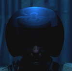
Hey everyone. First time posting here. I thought I'd share something I'm currently working on. So far it's just the head, but I'm in the process of doing the whole body.
- Attachments
-
- Pfhor_Head.png (789.67 KiB) Viewed 11723 times
jikes, zbrush amirite?
Last edited by CryoS on Mar 20th '10, 20:12, edited 1 time in total.
What are you, if not seven different shades of stupid?
CryoS wrote:jikes, zbrush amirite?
Yup, I've been trying to learn Zbrush off and on for a long time. Finally sitting down and making something. Once it has been completed, my ultimate goal will to have it printed out using one of those 3D print services so I can have it on my desk.
haha that is very nice, feel free to mail me one (or atleast upload a picture of it  )
)
What are you, if not seven different shades of stupid?
So I have been working on the Pfhor body a bit. It's still a work in progress, but here is the body so far. What do you guys think?
- Attachments
-
- Pfhor_back.png (113 KiB) Viewed 11711 times
-
- Pfhor_front.png (147.91 KiB) Viewed 11713 times
looking good there, the lower torso seems a wee bit too high up but otherwise i think it looks good yeah.
What are you, if not seven different shades of stupid?

praise:
I think you got a good proportion between body parts.
my own tastes:
I think you should lean him down a bit. Make him insect strong, not human strong.
I think his teeth should be thicker. He won't eat anything but liquid with toothpicks as teeth.
I think you got a good proportion between body parts.
my own tastes:
I think you should lean him down a bit. Make him insect strong, not human strong.
I think his teeth should be thicker. He won't eat anything but liquid with toothpicks as teeth.
I definitely agree about the teeth. They are so small they don't show up on the full body render.
I thought about making the body appear more boney. I'll see if I can play around with it a bit.
Thanks for the comments.
I thought about making the body appear more boney. I'll see if I can play around with it a bit.
Thanks for the comments.
-
Crater Creator
- Vidmaster
- Posts: 943
- Joined: Feb 29th '08, 03:54
- Contact:
Very impressive. Welcome to the Pfhorums, and thanks for sharing with us.molkien wrote:So I have been working on the Pfhor body a bit. It's still a work in progress, but here is the body so far. What do you guys think?
A couple things I would change on the head. I'd add more creases to the headtail, and make it somewhat longer and thinner. You've caved in its temples nicely, but now the cheekbones look too muscular. The nose and teeth are up to interpretation since we don't see them in Marathon, but in any case I'd push in the nostrils more so they look more like a passage leading into the head instead of dimples on the surface.
The body is tricky for me to analyze. The original art is in some ways muscular, with what look like pronounced quadriceps and pectorals, yet in other ways skeletal. For another thing, we never see a naked Pfhor without the colored suit. One thing that does come through in the sprites is that Pfhor have Y-shaped feet, which branch into 2 toes in roughly the same spot that a human's branch into 5. Overall, my first impression is that a lot of areas are 'too human', but the armor would cover these areas so it's really left to the imagination what they should look like.
-
tehWastedJamacan

- Vidmaster
- Posts: 1347
- Joined: May 17th '09, 16:24
- Location: SuFu, SD
- Contact:
working on a pic in MS Paint. Self-updating.
I'm done for now. Maybe I'll add a background later. Who knows. Any C&C would be greatly appreciated.
I'm done for now. Maybe I'll add a background later. Who knows. Any C&C would be greatly appreciated.
Last edited by tehWastedJamacan on Aug 17th '10, 08:20, edited 1 time in total.
D?rovací tvá?í.
Fobo: I find it hard to keep a sentence down under two paragraphs.

That looks too good to be made in MS Paint.
What I mean is... that no one should be allowed to do things that look good, using MS Paint. It's just wrong.
What I mean is... that no one should be allowed to do things that look good, using MS Paint. It's just wrong.

-
tehWastedJamacan
- Vidmaster
- Posts: 1347
- Joined: May 17th '09, 16:24
- Location: SuFu, SD
- Contact:
There are many who are much better than I.
D?rovací tvá?í.
Fobo: I find it hard to keep a sentence down under two paragraphs.
Hi. I'm a person who likes drawing stuff from old games. Last week it was System Shock, this week it's Marathon. I've just made a small Marathon page with my art. It's a bit more cartoony... but it's not a huge violation I hope, given Marathon's partly colorful hand drawn style. I tried to be faithful to the details of the sprites... I haven't actually gotten to the colors yet. And yeah, I picked the original eye Pfhor layout ('.') I liked it better than the serious 'enlightened' eye arrangement. I think a lower central eye makes the head more alien and less 'funny forehead'.
Yeah, that's it.
Yeah, that's it.
Last edited by Arne on Aug 29th '10, 15:33, edited 1 time in total.
-
tehWastedJamacan
- Vidmaster
- Posts: 1347
- Joined: May 17th '09, 16:24
- Location: SuFu, SD
- Contact:
I really like these. Also, the MADDs were in M1A1, they helped you out early in the game.
D?rovací tvá?í.
Fobo: I find it hard to keep a sentence down under two paragraphs.
Looking good Arne. Checked out your other stuff as well. You can draw well!
Those are cool! You're now officially required to make the Marathon online comic. Maybe base it on some of the existing fan-fiction.
-
L'howon
- Vidmaster
- Posts: 898
- Joined: Mar 18th '08, 12:49
- Location: Somewhere outside the Citadel Of Antiquity
- Contact:
You do work on Cortex Command's art, don't you? I knew I recognized that style somewhere. Very neat stuff, all around.Arne wrote:Hi. I'm a person who likes drawing stuff from old games. Last week it was System Shock, this week it's Marathon. I've just made a small Marathon page with my art. It's a bit more cartoony... but it's not a huge violation I hope, given Marathon's partly colorful hand drawn style. I tried to be faithful to the details of the sprites... I haven't actually gotten to the colors yet. And yeah, I picked the original eye Pfhor layout ('.') I liked it better than the serious 'enlightened' eye arrangement. I think a lower central eye makes the head more alien and less 'funny forehead'.
Yeah, that's it.
Last edited by L'howon on Aug 29th '10, 23:57, edited 1 time in total.
I have been wading in a long river and my feet are wet.

Hey, Arne, was that an M1 enforcer?
They were so much cooler than the later enforcers.
They were so much cooler than the later enforcers.
I am Daemon. I am not an entity, I am in time. My time is now. The word, is Cron.
Why do they suffer needlessly when the Word is inevitable?
Why do they suffer needlessly when the Word is inevitable?
Those look great. I could almost see these figures in a RTS game or something similar.
underworld : simple fun netmaps // prahblum peack : simple rejected netmaps
azure dreams : simple horrible netmaps // v6.0!!!: thomas mann's greatest hits : simple simple netmaps
azure dreams : simple horrible netmaps // v6.0!!!: thomas mann's greatest hits : simple simple netmaps
Thanks!
Yeah, it's the first enforcer type. It's a more odd design and I like working with that. I couldn't quite make sense of the gun-arm though, so I made it into big weapon carried on the shoulder.
And yes, I do art for Cortex command. Slightly related, I made a System Shock page recently.
I'm not sure what to make of Marathon. It has a lot of running around "in a maze of twisty little passages, all alike", not finding the last button to push. I wish the textures weren't so randomly applied. Low rez textures can look fantastic if the detail plays along with the geometry.
I really enjoy the little BOB assisted battles though. It makes the game feel less player centric, which I like. The console illustrations in the second game makes console hunting more tolerable too. The story seems pretty interesting overall.
Well, those are my early impressions.
By the way, I've been exploring your site and, regarding Zerberk, I LOVE ROBOTRON (never played Berzerk, though). This warmed my heart: "I'll probably do a dual analog thing of this. A 360 Robotron kinda thing." I guess you never finished the game, but it's fascinating reading. Somehow you slipped under my "cool new Pfhorums member" radar for a bit, but that mistake has been corrected.
underworld : simple fun netmaps // prahblum peack : simple rejected netmaps
azure dreams : simple horrible netmaps // v6.0!!!: thomas mann's greatest hits : simple simple netmaps
azure dreams : simple horrible netmaps // v6.0!!!: thomas mann's greatest hits : simple simple netmaps