I'm looking for Marathon-esque themes. Lots of sites (including this one) use the predominantly black design (maybe with some bright green and dark red highlights), and that's fine. But is that all there is?
If you were going to design a website that looked like it was designed by Pfhor, what would it look like?
What kind of layout, font, and color choices would make you think you'd accessed the S'pht network on Lh'owon?
What Would Durandal Do?
Are there already fan sites out there that incorporate this type of approach in their design? If so, please let me know.
web themes
It seems that most admins take inspiration from the terminal interfaces used to communicate the story throughout the trilogy as a representation of the layout/font/colors that the Pfhor and Lh'owon used on all their computer systems. This results in Jjaro designs like FBO and terminal-y interfaces like MBO the story page.
The Pfhorums originally ran a theme called "Hardwired." It was probably chosen to be dark because FBO was dark. Also, PHP board themes are really ugly, so I probably just used the first dark theme that didn't look like crap. Of course, then it was customized with a cool logo and header and smileys and all that junk.
The new Pfhorums theme was chosen to be similar to "Hardwired." Again, PHP board themes are really ugly so I picked the best theme I could find and then worked to correct the most glaring design crimes while adding some Marathon touches.
Simplici7y is not dark, and does not include any red or green highlights. It's probably the least "Marathon" inspired design in the community. So, that adds to variety, but it doesn't really help you find designs that are both marathon inspired and different.
I think that the website for Rubicon X is one of the most stunning websites in the community. It's up to you to decide how Marathon inspired you think it is.
?appleswitch wrote:terminal-y interfaces like MBO.
Sorry, I meant http://marathon.bungie.org/story/. I don't know what I'm supposed to call that. The story page?treellama wrote:?appleswitch wrote:terminal-y interfaces like MBO.
More importantly, this brings to attention my glaring omission of the new MBO, which is absolutely stunning, marathon inspired, and not red or green. It was designed by treellama, and stole the show almost instantly on MSF where MBO work was being discussed.
Really, the only complaint anyone could have about the new page is that the Pfhorums are all the way at the bottom
Yes, The Story page.appleswitch wrote: Sorry, I meant http://marathon.bungie.org/story/. I don't know what I'm supposed to call that. The story page?

It does sadden me a bit that so many 'thon sites are inspired by the limited design and colour scheme of the terminals while we have such an amazing amount of colour schemes throughout the series. Like for example the Marathon 2 water set and the Lhowon colours. I for example loved the color scheme of the previous MBO although the design was quite horrible by today's standards (and on today's screens)
-
ChristTrekker
- Cyborg
- Posts: 175
- Joined: Dec 17th '07, 23:34
- Contact:
That's kind of what I was thinking when I started this thread. Specifically, the purples of the Sfiera (and Phfor generally) came to mind, and I'd wondered why there aren't more purples in Marathon site designs. No love for Pfhor, I guess.JohannesG wrote:It does sadden me a bit that so many 'thon sites are inspired by the limited design and colour scheme of the terminals while we have such an amazing amount of colour schemes throughout the series. Like for example the Marathon 2 water set and the Lhowon colours. I for example loved the color scheme of the previous MBO although the design was quite horrible by today's standards (and on today's screens)
When redesigning m.b.o., there was a purple option for a while. Hamish and I prefered orange so that's what it ended up being.
The old fileball used Lhowon colors.
The old fileball used Lhowon colors.

The Story forum thread on the MBO redesign had some alternate proposals that are still online. Forrest's are dark M1-style drafts; Diogenes used the Despair chapter screen to set the tone. (I bet Citadel would make for a neat color palette too.)
Diogenes: one - two
Forrest: one - two - three - four
Oh, and here's a cache of the old Fileball design Treellama mentioned.
Diogenes: one - two
Forrest: one - two - three - four
Oh, and here's a cache of the old Fileball design Treellama mentioned.
-
Crater Creator
- Vidmaster
- Posts: 943
- Joined: Feb 29th '08, 03:54
- Contact:
Saddened would be too strong a word for me. I think it's only natural for websites, at least many kinds of websites, to use themes from Marathon's terminals. Both terminals and websites like forums and blogs are largely text-based forms of communication which we specifically associate with computers and the net. One may argue it's unimaginative, but terminal-inspired themes seem like the closest one can get to making a Marathon website look like it exists within the canon. Using art from Marathon wall textures or landscapes is fine too, but it's a further step removed.
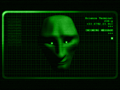
Since we're talking about theme... for me, I like visual representations of cyberspace. I like terminals that go out of their way to look like terminals. It's an artistic struggle in futuristic works to make something look identifiably 'like a computer,' since display technology has long since removed old limits on what you can see on a screen. To wit, the Marathon would've had to have been built by engineers that had been in stasis since circa 1980 to be built with terminals that can only show green-on-black text in 10 point Courier. And yet, terminals have a certain charm and uniqueness to them precisely because of that minimalist style. Stuff like this is nostalgic, and I wouldn't mind seeing more of it, in web design or elsewhere.
Since we're talking about theme... for me, I like visual representations of cyberspace. I like terminals that go out of their way to look like terminals. It's an artistic struggle in futuristic works to make something look identifiably 'like a computer,' since display technology has long since removed old limits on what you can see on a screen. To wit, the Marathon would've had to have been built by engineers that had been in stasis since circa 1980 to be built with terminals that can only show green-on-black text in 10 point Courier. And yet, terminals have a certain charm and uniqueness to them precisely because of that minimalist style. Stuff like this is nostalgic, and I wouldn't mind seeing more of it, in web design or elsewhere.
-
Ares Ex Machina
- Mjolnir Mark IV
- Posts: 614
- Joined: Jan 23rd '08, 08:07
- Contact:
Maybe in the future, they become advanced enough to realize simple is better.Crater Creator wrote:To wit, the Marathon would've had to have been built by engineers that had been in stasis since circa 1980 to be built with terminals that can only show green-on-black text in 10 point Courier.
Yikes.Crater Creator wrote:Stuff like this is nostalgic, and I wouldn't mind seeing more of it, in web design or elsewhere.
-
ChristTrekker
- Cyborg
- Posts: 175
- Joined: Dec 17th '07, 23:34
- Contact:
I agree with what you've said here. I've done a lot at Traxus, and much of it inspired directly from terminals, for exactly the reasons you describe. I'm looking for more alternatives, that don't necessarily require graphical design talent beyond maybe an eye for color. I may have to peruse some of the texture sets. Also poke through my font collections looking for "blocky" (S'pht) and "angular" (Pfhor) faces. Beyond the obvious textual characteristics, what terms describe the aliens themselves, in attitude or appearance, that could go toward informing a design?Crater Creator wrote:I think it's only natural for websites, at least many kinds of websites, to use themes from Marathon's terminals. Both terminals and websites like forums and blogs are largely text-based forms of communication which we specifically associate with computers and the net. One may argue it's unimaginative, but terminal-inspired themes seem like the closest one can get to making a Marathon website look like it exists within the canon. Using art from Marathon wall textures or landscapes is fine too, but it's a further step removed.
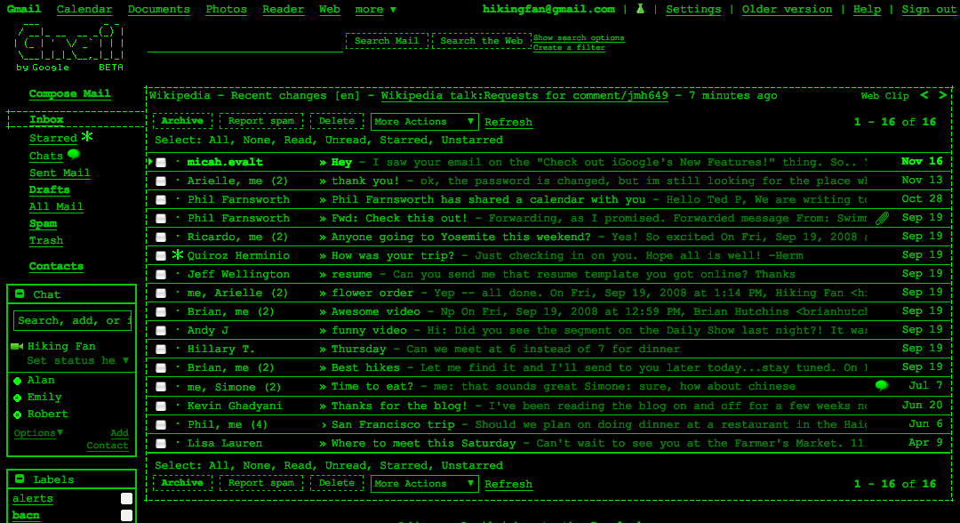
Those are fantastic! Is that a real Gmail theme? I need to repost those on some of my retro-computing communities.Crater Creator wrote:I like terminals that go out of their way to look like terminals. It's an artistic struggle in futuristic works to make something look identifiably 'like a computer,' since display technology has long since removed old limits on what you can see on a screen. To wit, the Marathon would've had to have been built by engineers that had been in stasis since circa 1980 to be built with terminals that can only show green-on-black text in 10 point Courier. And yet, terminals have a certain charm and uniqueness to them precisely because of that minimalist style. Stuff like this is nostalgic
Dang, now I'm going to be on a quest for retro themes. I know the Opera browser used to include a user CSS that would strip images, linearize content, and display it in a fixed font. Looked like you were surfing the net on an 8-bit computer.
Has anyone tried building ℵ₁ with libcaca, like text-mode Doom?
Yeah, minimalist. Maybe someday HTML/RT email will be passé, and we can get back to just reading for the content. (Pine and lynx were fine in my day. Get off my lawn!)Crater Creator wrote:I wouldn't mind seeing more of it, in web design or elsewhere
I still use elinks and alpine every day.